How a professional developer builds free online tools with AI in 2026

John Richardson
Fullstack PHP developer
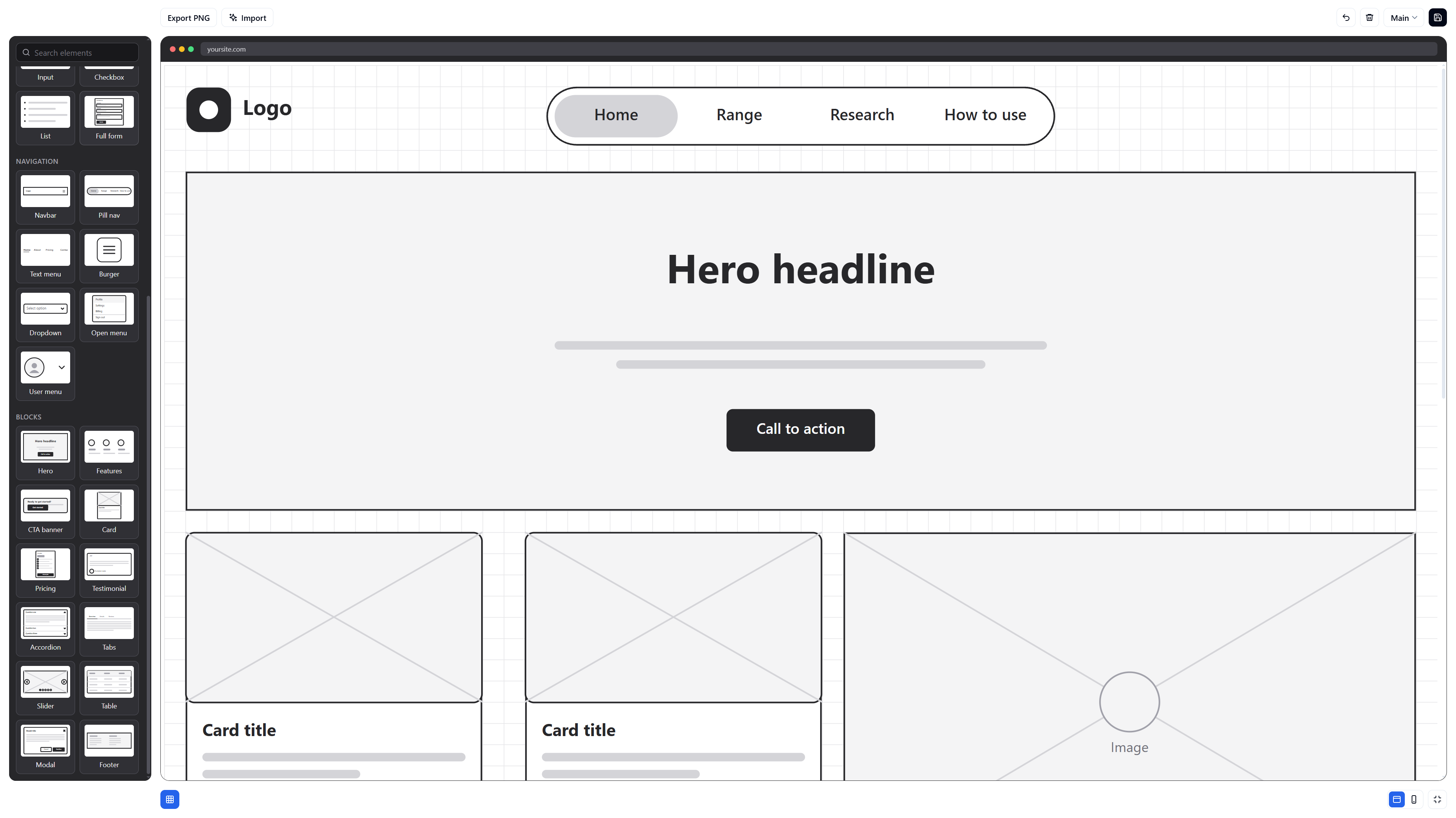
Building free tools is one of the most common ways to promote a site and its services. With AI you can now build them in a fraction of the time, though there are better ways to steer it than just saying “create a tool”. Do that and you’ll get something, but rarely something good.
I want to demonstrate the better way. So I built a real product with Claude Code, a free online wireframe tool that runs entirely in your browser (with no sign-up), and I’ll show you how I directed it at each step so you can create free online tools like a pro.
We'll cover
- The research to do before you write a single prompt
- Why I work iteratively: a small first prompt, and what the first review turned up
- Refining the tool one request at a time, with git as the safety net, and why the design changed
- SEO, mobile support and making the tool friendly to AI assistants
- The lessons I'd pass on
If you’d rather just see the result, you can try the wireframe tool now.
1. Research first
It’s always tempting to just jump straight in with AI, but hear me out. Unless you understand what you’re building to at least some degree, you’re going to get generic and/or poor results. So before writing a single prompt, I spend some time building an understanding of what I want to make, what the common approaches are and what the shape of the thing ought to be. Even 10 minutes should give you much better results, and this case was no different. I looked at what existing low-fidelity wireframe kits contain.
I wanted to understand the basics: what people actually want to drop on the canvas.
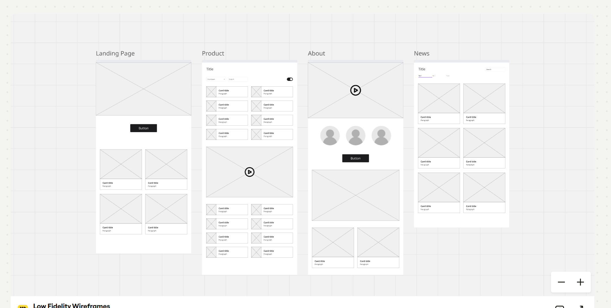
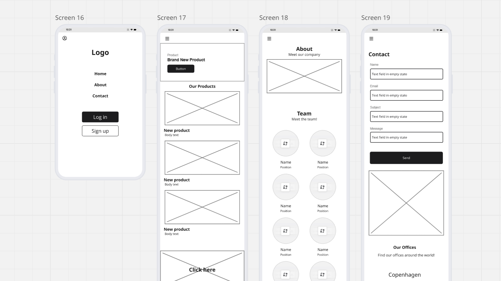
A few patterns jumped out:
- Boxes with an X for images, grey placeholders for everything else. The tool only needs enough detail to show where things go. Fine details aren’t necessary at this stage.
- Common blocks: a hero, a grid of cards, a form, a footer, a team grid with avatars.
- The option to create mobile versions as well as desktop.
That list became my element inventory. Combined with my not insubstantial experience of the web, it meant I could prompt with specifics.
2. Start small and iterate
The approach that runs through this whole post is iterative: ask for a small piece, review it, then ask for the next. You don’t need to aim for everything in the first prompt. If you do, it gets hard to review and hard to rewind when something goes wrong, because you can’t tell which change caused what.
Instead, I like to work in small chunks, the way I did before AI. The reason is bandwidth: we only have so much of it, and trying to review an entire app in one fell swoop is a fool’s errand. You’re going to miss a ton. So I asked for just the basic layout on screen, so I could review it and see where everything was going to sit before refining anything.
The research comes back into play in the prompts that follow, as each piece becomes relevant. The first prompt stays small:
Build the bare minimum of a free online wireframing tool that runs in the browser. Vanilla JavaScript only, no frameworks or dependencies.

Basics only: a canvas and a short list of basic elements the user can add (box, circle, image, heading, paragraph, button, input, list). They can drag to move, resize from the corners, edit text and delete. Draw it as SVG. Keep all state in the browser.

Leave everything else out for now. No extra blocks, no export, no saving, and nothing I haven't listed. I only want the bare bones on screen so I can review where things sit, then I'll iterate.
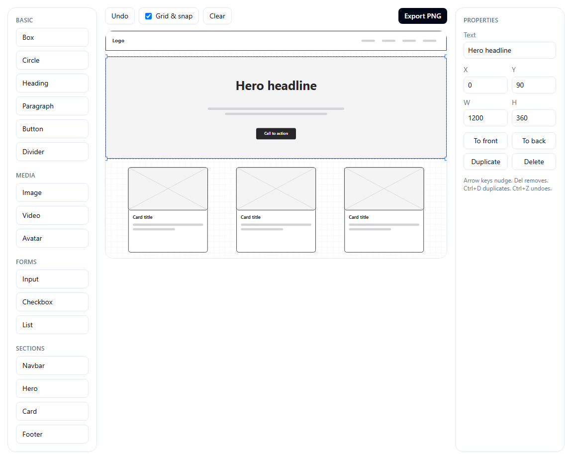
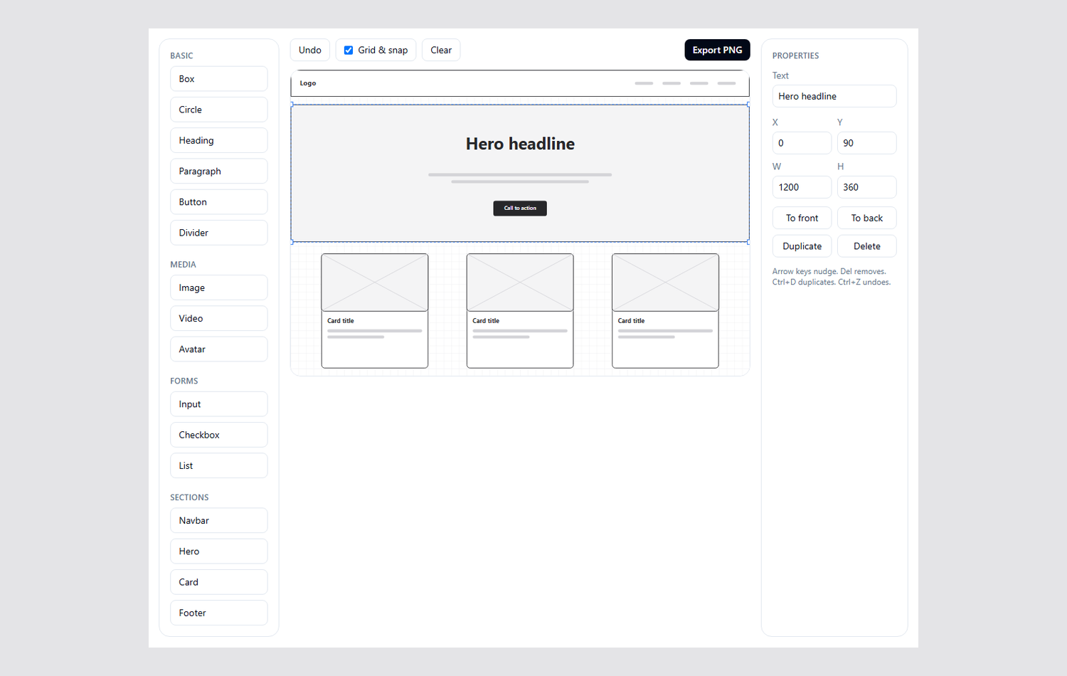
Result
3. The first iteration: reviewing what I got
As you can see above, the first prompt was pretty successful. We’ve got the fundamentals in place, and enough to review and work from.
This is a good moment to bring in git, a fundamental part of any solid dev workflow. Put simply, it records your project as a series of saved snapshots called commits, so you can compare any two or roll back to an earlier one.
The idea is to commit after each iteration. That way, if a change gives you something unintended, or the AI messes things up, you can roll back to the last good state instead of untangling it by hand. Git is a bit too big to cover properly in this post, but if you’d like a guide to using it with AI, get in touch and I’ll write one.
With that in place, my approach is simply to pick out the most glaring issues and work through them one by one. None of them were bugs in the “it crashed” sense. They were the kind of thing you only notice when you actually use the tool on your own site:
- It was too narrow. The AI had put the tool inside my site’s normal content container, the same narrow column the blog posts sit in. A wireframe canvas needs room, and with a sidebar either side the drawing area was cramped.
- Tons of elements were missing. The first version had just 16 basics. There was no full form, no logo, no menus or dropdowns, and none of the blocks real pages are made of: accordions, sliders, pricing, testimonials, modals.
- Elements didn’t quite fit. Things dropped in slightly off the edge of the canvas, so outlines got clipped.
- The palette wasn’t easy to scan. It was a list of words, like “Hero” and “Card”, rather than meaningful previews, so you had to remember what each one looked like.
- The controls weren’t intuitive. Related things weren’t grouped together. The properties panel sat in a fixed column away from the element you were editing, and the toolbar buttons were scattered.
- It was desktop only, with no scrolling. There was no mobile version, and a layout couldn’t grow past the edge of the canvas.
Here’s one example, so you can see how I described it. The layout was off by a single grid square:
The hero element can render slightly wider than the artboard, by a pixel or a grid square, so its outline gets clipped. Constrain elements to the artboard bounds so they can never overflow it.The AI had let elements sit slightly outside the artboard, and the outlines were being clipped at the edges. It was a small fix. The palette needed a bigger rethink, so I attached a screenshot of a palette from a design tool I like and put it like this:
The element palette is hard to scan because it's only a list of names. Using the attached screenshot as a reference, replace it with a grid of tiles that each show a small preview of the element, and group related elements into sections.You’ll notice that, even as a developer, I’m not updating the code myself. I am reviewing it after each set of changes, though. I’m looking for security or performance issues, poor architecture that’s going to be hard to work with later, and unreadable code. Sometimes I refactor that myself, and other times I have the AI refine it and review again.
This is the part you may not be able to do on your own, and I’d be happy to help. If you’d like a developer to review what the AI has built for you, get in touch.
4. Then keep iterating, one request at a time
The rest of the build is that same step repeated. Pick the most glaring issue, make a single request, review the result, commit it, then pick the next. It works the same way for any tool, and each pass is small enough to review properly and easy to undo if it goes wrong.
Here’s a glimpse of what that meant for this particular tool. Each prompt drew on the research or on something I’d noticed by using it, and I never asked for a rewrite.
Make it feel like a real tool
With previews in place, I kept polishing the tool:
Style the scrollbars to suit the tool, and add a search field with an icon at the top of the palette to filter elements.and:
Convert the undo and clear buttons to icon-only buttons and align them to the right of the toolbar.and:
Restyle the browser frame so it stands out against the page. A dark grey title bar would work.and:
Add fullscreen support: an icon button at the bottom right of the tool that expands it to fill the screen on click, and restores the normal layout on a second click.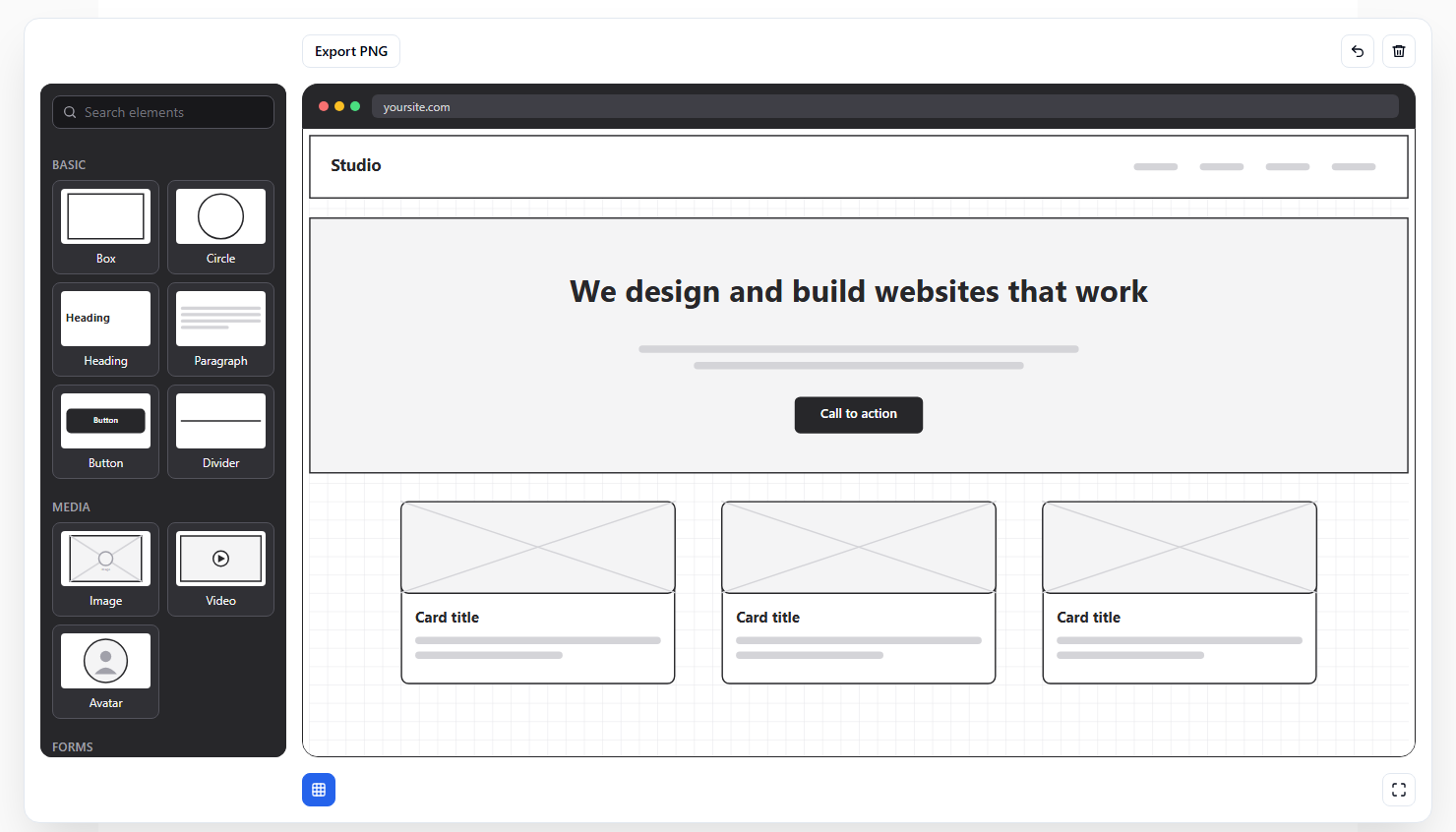
Selecting and editing like you’d expect
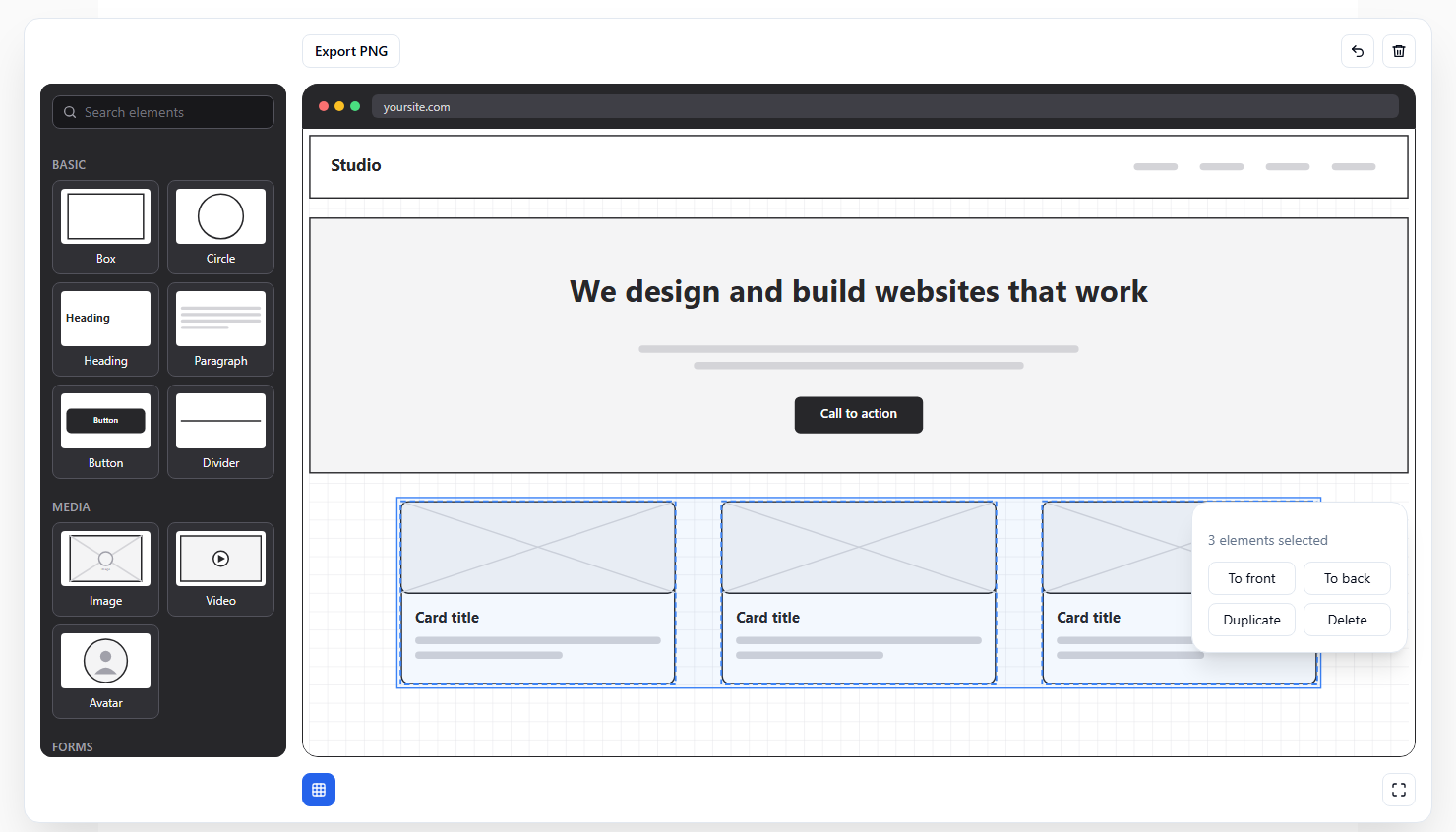
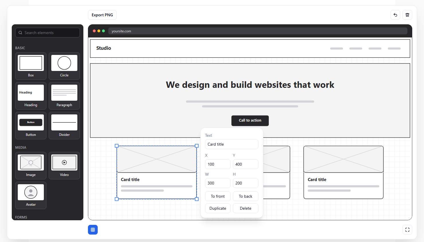
Add multi-select: marquee selection by dragging a box around elements, and shift-click to add or remove elements from the selection. A selection should move and duplicate as one group.Position the properties panel next to the selected element, on its right, or on its left when there isn't enough room on the right.The second one changed the feel of the whole tool. The controls now appear next to the thing you’re working on, so you never have to look away from the canvas.
Real-world needs
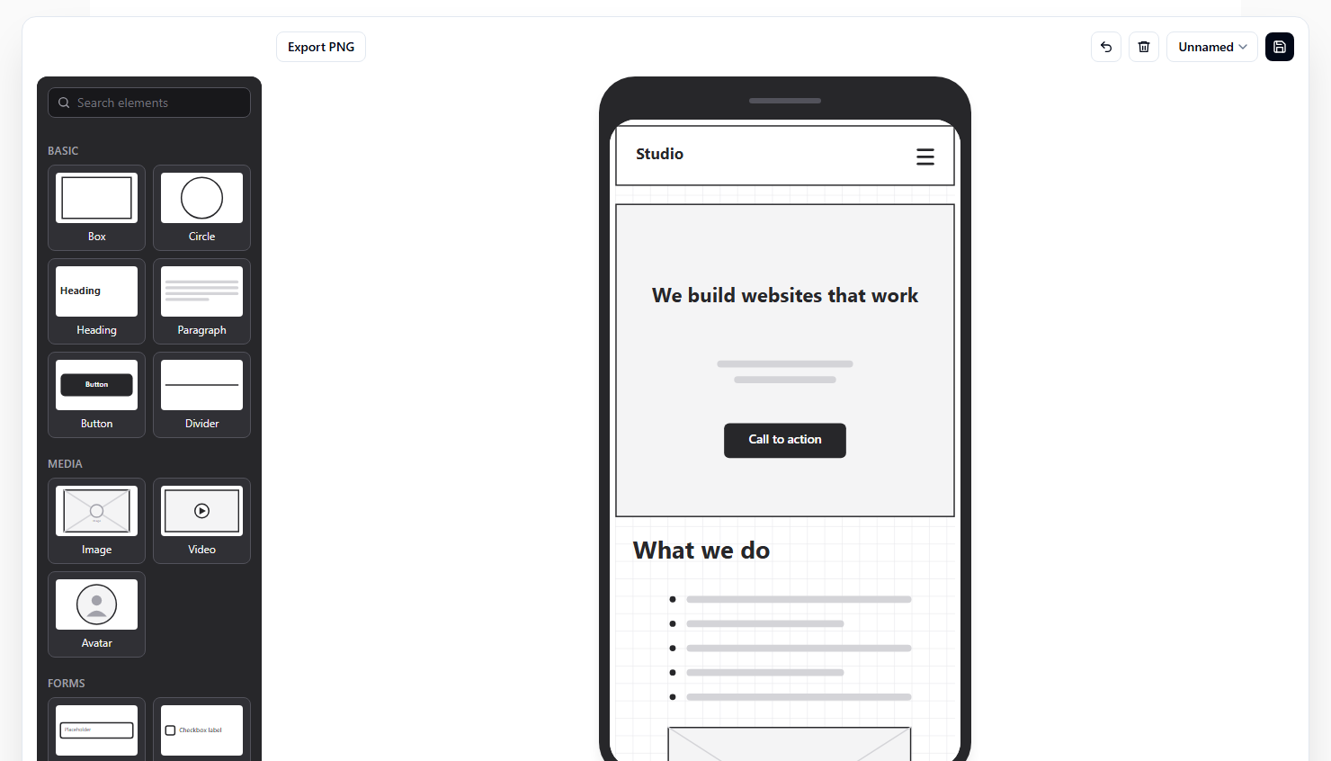
Add a switch between a browser frame and a phone frame, each with its own layout. The canvas also needs to scroll once content extends beyond the frame.Add save and resume: users can save a project under a name and reopen any saved project from a list. Persist it in localStorage, with no backend.Browser and phone frames each keep their own layout, because a mobile design is a different page. Saving is plain local storage, so there are no accounts and nothing to host.
More elements, and better names
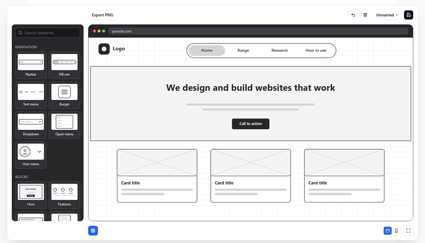
Add a complete form element, with fields and a submit button, that can be dropped onto the canvas in one go.Add a logo element, and a floating, pill-shaped nav bar element like the one in the attached screenshot.Names and grouping matter in a palette, so I made the call on both:
Rename the floating nav to "Pill nav", which describes what it is. Add a Navigation group for the common top-of-page patterns: a burger menu, a dropdown, a user avatar with a dropdown menu, and a horizontal text menu.That gave the palette a proper Navigation group. And later:
Rename the "Sections" group to "Blocks", which is the term designers expect. Add the common blocks that are missing, such as an accordion, a slider, tabs, a table, a modal and pricing.That became the “Blocks” group. Bring your own domain knowledge to names and categories. The AI builds what you describe, so what things are called and where they belong are yours to decide.
A starting point for every project
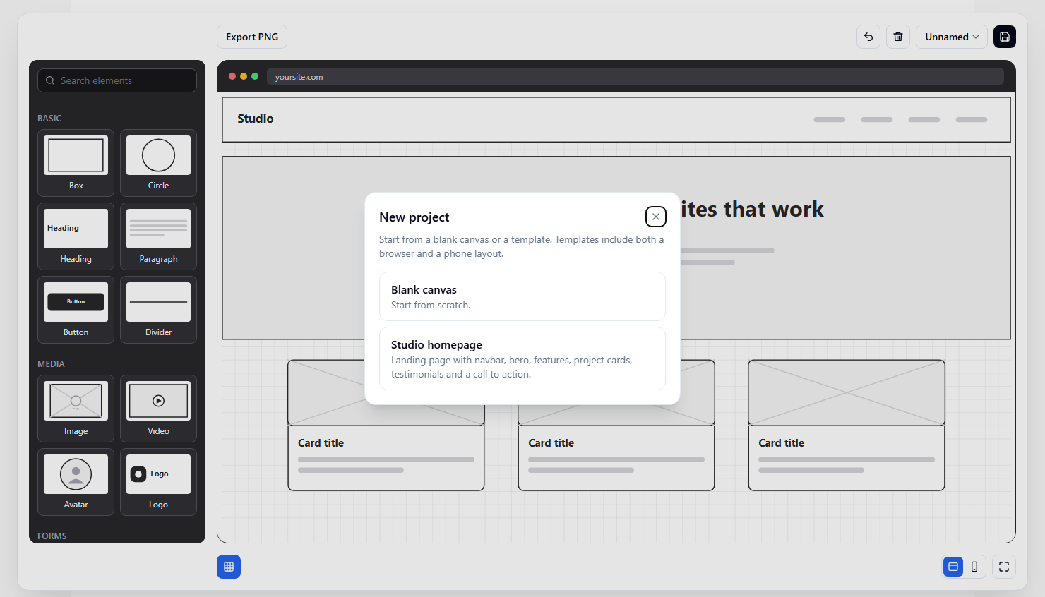
An empty canvas is intimidating, so I asked the AI to mock up a whole site in the tool, which became a template. It first appeared as its own toolbar button, and that didn’t feel right:
The Studio template shouldn't have its own toolbar button. Let's improve the UX: when the user clicks New, present a dialog with a Blank option and a choice of templates, starting with Studio.Now New opens a small dialog with a blank canvas or a template, and each template comes with both a browser and a phone layout. The AI built exactly what I asked for. It took me using it to see that a lone button on the toolbar was the wrong home for it.
Notes you can hand back to the AI
The last feature came from thinking about the whole loop around the tool:
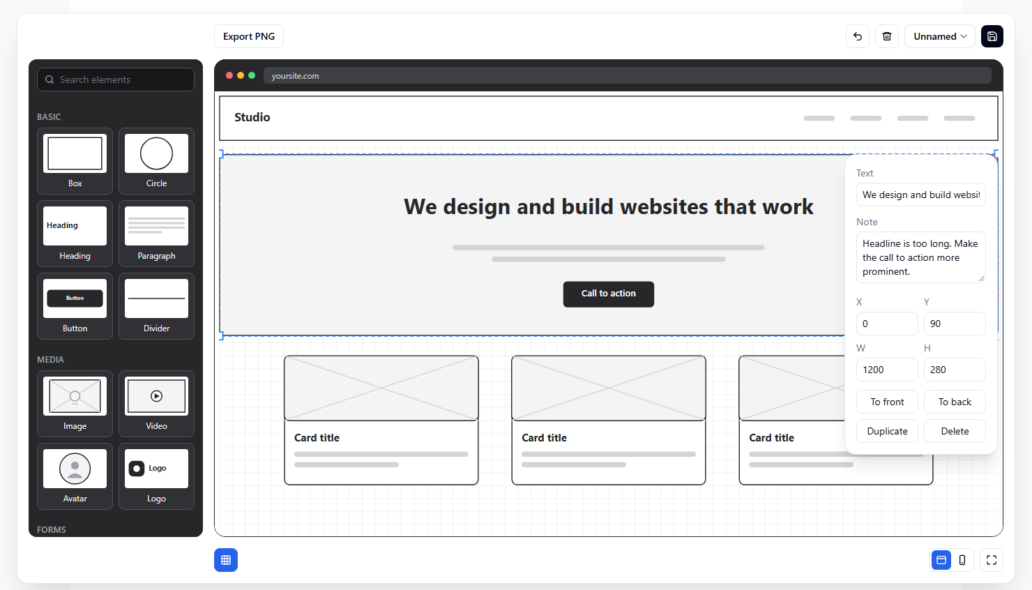
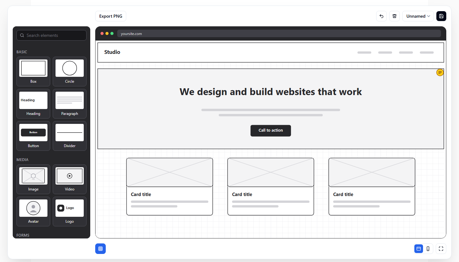
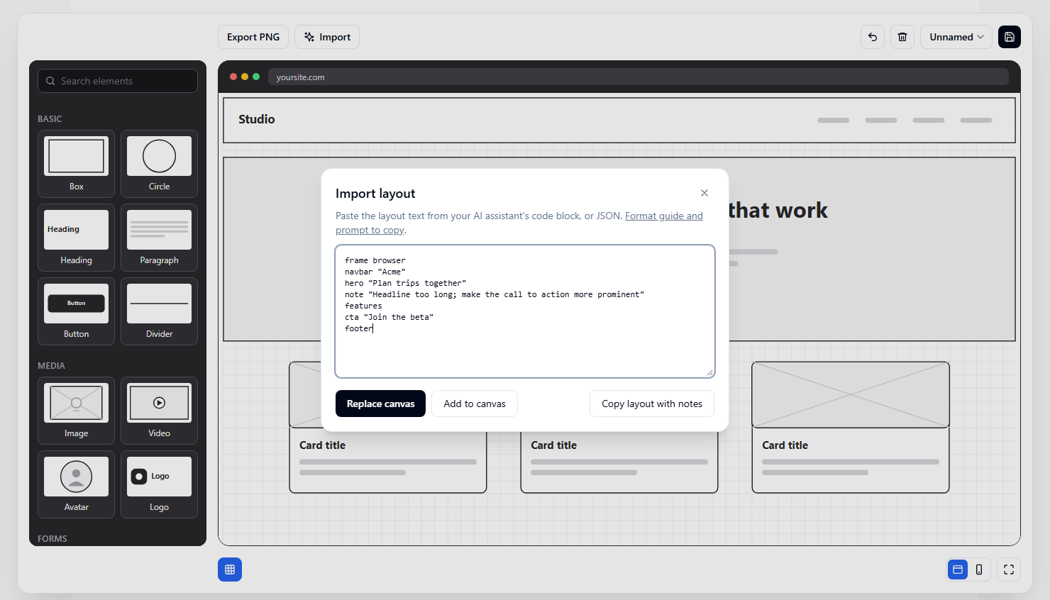
Add support for notes on elements, so a user can record issues against specific elements and pass the layout back to an AI assistant to act on.Now you can select any element, type a note (“headline too long, make the call to action more prominent”), and a yellow badge marks it on the canvas. When you copy the layout, the notes travel with it as plain text, so you can paste the whole thing back into your AI assistant and ask for changes. It turns a vague “make it better” into specific, element-level feedback.
The little things add up
The tool went from “works” to “feels right” through lots of tiny, specific requests. A handful of them, tidied up:
Use styled tooltips instead of the native title attribute.

Esc doesn't close the properties panel when focus is in a text field. It should.

The sidebar should start level with the top of the browser frame, rather than level with the toolbar buttons.

It should also end where the browser frame ends.

Make Save the primary action at the far right of the toolbar, with Export as the secondary action.

In the project dropdown, make Save as and New two 50%-width buttons with no top border.
None of these is hard. But each is something you only notice by using the thing, and each one is a thirty-second request.
5. How I changed the design, and why
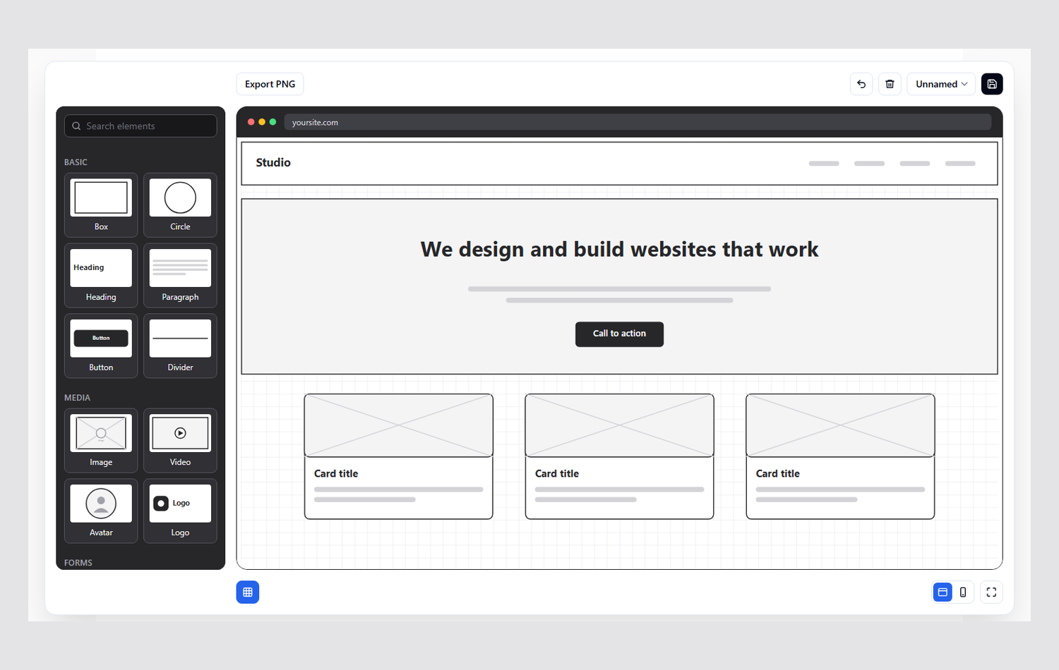
Most of these started as “that feels off”.
| Change | Why |
|---|---|
| Previews on every palette tile | You recognise a shape faster than you read a name |
| Dark sidebar | Separates the tools from the canvas, so the page you’re drawing is the brightest thing on screen |
| Darker browser bar, plus a few pixels of white around the screen | Makes the frame read as a frame, and makes the edge of the artboard visible |
| Properties panel floats next to the selection | No eye travel between the thing and its controls |
| Icon-only toolbar, Save as the main action on the right | Saves space, which is particularly useful on mobile where room is limited and buttons start collapsing onto new lines |
| The tool sits in its own box that breaks out of the page width, with a soft shadow | A canvas needs room that article text doesn’t |
| Sidebar capped to the window height and stuck in place | You never have to scroll to find the next element |
 First version
Now
6. A proper SEO and content pass
A free tool only promotes your site if people can find it, so I treated the tool page like any other page I’d optimise for a client. The tool itself was only half the page. The other half was giving search engines, and visitors, a reason to stay.
Do an SEO pass on the tool page, targeting "free online wireframe tool". Write a descriptive title and meta description, add structured data, and add a section below the tool explaining what it does, who it's for and how to use it, with useful FAQs.What that covered, and why each piece matters:
- One clear target phrase. The page is about a “free online wireframe tool”, so that phrase sits in the title, the meta description, the main heading and the opening copy. Natural wording beats repetition.
- A title and description that sell the click. They say what it is, that it’s free, and that there’s no sign-up, which are the things a searcher wants to know before clicking.
- Real content around the tool. A tool on its own is mostly JavaScript, which gives search engines little to read. A section below it explains what the tool does, lists its features and walks through the steps in plain HTML.
- FAQs that answer real questions. They target the questions people actually search for, and one of them makes an argument for the tool itself: why use wireframes at all, and what you save by settling the structure before anything is built.
- Structured data. The page declares itself as a web application, marks up the FAQs, and includes breadcrumbs, so search engines can show richer results.
- Visible breadcrumbs and internal links. These help users navigate the site as well as improving internal linking, a core facet of on-site SEO.
- Honest copy. It’s a fast, low-fidelity tool, so that’s what the copy says. If there’s a disconnect between what’s offered and what your SEO content describes, you’ll be found out sooner rather than later.
7. Making it work on a phone
Mobile first is the usual way of doing things: design for the smallest screen, then scale up. I’ve done it in reverse here. I built the desktop version first and came back to mobile afterwards, partly because I was working through the build quickly for demonstration purposes. It’s a reminder of why mobile first is the norm. Desktop-first tools often fall apart on a phone, and retrofitting is more work than starting there.
So I came back with a specific request to make the tool itself usable on a phone:
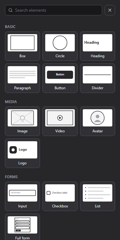
Make the tool work properly on mobile, on screens under 1024px wide. The sidebar palette should become a full-screen sheet, opened by a floating plus button. Choosing an element should add it to the canvas and close the sheet. Elements need to be draggable by touch without scrolling the page, and the resize handles should be bigger for fingers.That worked, but a plus button floating over the canvas felt clumsy on a small screen, so I changed the interaction:
On mobile, remove the plus button and instead show a message telling users to tap an empty space on the canvas to add an element.On mobile, make the tool about 80vh tall and make sure the canvas spans the full width.On a phone, the sidebar becomes a full-screen picker. You tap empty canvas, choose an element, and it lands where you tapped. A one-off message explains this the first time.
8. Making it friendly to AI too
I wanted the tool to be somewhat AI friendly too. This is a static site with no backend, so an MCP server was off the table. Instead I went for something simple: a serialized plain-text format for layouts that any assistant can write, and an Import button that reads it.
I asked the AI to define the format and describe it on a page written for agents:
Define a serialized plain-text format for layouts that an AI agent can generate, one element per line: the element type, optional x y w h, and optional quoted text. A "frame browser" or "frame phone" line starts a section for that frame, lines with no coordinates auto-stack top to bottom, and JSON is also accepted.

Document it on a page written for agents, with a plain-text version alongside. List the format, every element type with its default size, and a ready-made prompt that users can copy into an assistant.

Don't encode layouts in URLs. Real layouts get too long.Then I added the other half, the way in:
Add an Import button and dialog where the user pastes a layout, with Replace canvas and Add to canvas options.

Support notes: a line starting with note attaches feedback to the element above it, and a "Copy layout with notes" button hands the layout back to the assistant.
That gave me the Import button and an AI assistant guide with a ready-made prompt. I tried it with my own agent. It read the guide, made sense of the format and came back with a decent layout, which I pasted straight in. Pasting text also works with any chat assistant, so you can ask one for a layout and import it the same way.
9. What I’d tell anyone trying this
- Research first. Ten minutes on the domain makes every prompt sharper.
- Work iteratively. Start with the smallest thing that exists, review it, then go on in single-idea prompts. Reviewing a whole app in one go means you’ll miss a ton.
- Describe what you see, or paste a screenshot. The AI can’t look at your screen.
- Bring your domain knowledge. Names, groupings and what belongs where are yours to decide.
- Make it run and test its own work, and review the diff like you would a colleague’s.
- Give it a way to look. I only did this at the end, when the AI drove a real browser to take the screenshots for this post. I wish I’d set that up from the start: it spots layout problems you’d otherwise have to describe.
- Stay the editor. The AI is fast, but the product decisions are still yours.
- Learn to read the code. The AI does the legwork now, but you’ll ultimately be in a much better place if you can read it and make sense of it, and understand the bad practices to watch out for: security holes, slow code, tangled architecture. None of them announce themselves, and the AI won’t always flag them.
- Use git. It’s a fundamental part of any solid workflow, and more important with AI than without it. Commit after each iteration and a bad turn is a few seconds from being undone, and the history shows exactly what the AI changed.
- Know your limits. If you don’t understand security, there are limits on what you can safely host. This tool is a static page that runs entirely in the browser, so there’s very little to attack. Add logins, payments or user data and you need to know how to protect them, or have someone who does review the code before it goes live.
Try it
The result is a free tool you can use right now: open the wireframe tool. Drag elements around, switch between browser and phone, or ask an AI assistant to draft a layout and import it.
If you’d like a change, or you have a tool or website in mind that you’d like built properly, get in touch.